
UX CASE STUDY:
Arlington Boys and Girls Club
UX CAPSTONE PROJECT FOR SPRINGBOARD
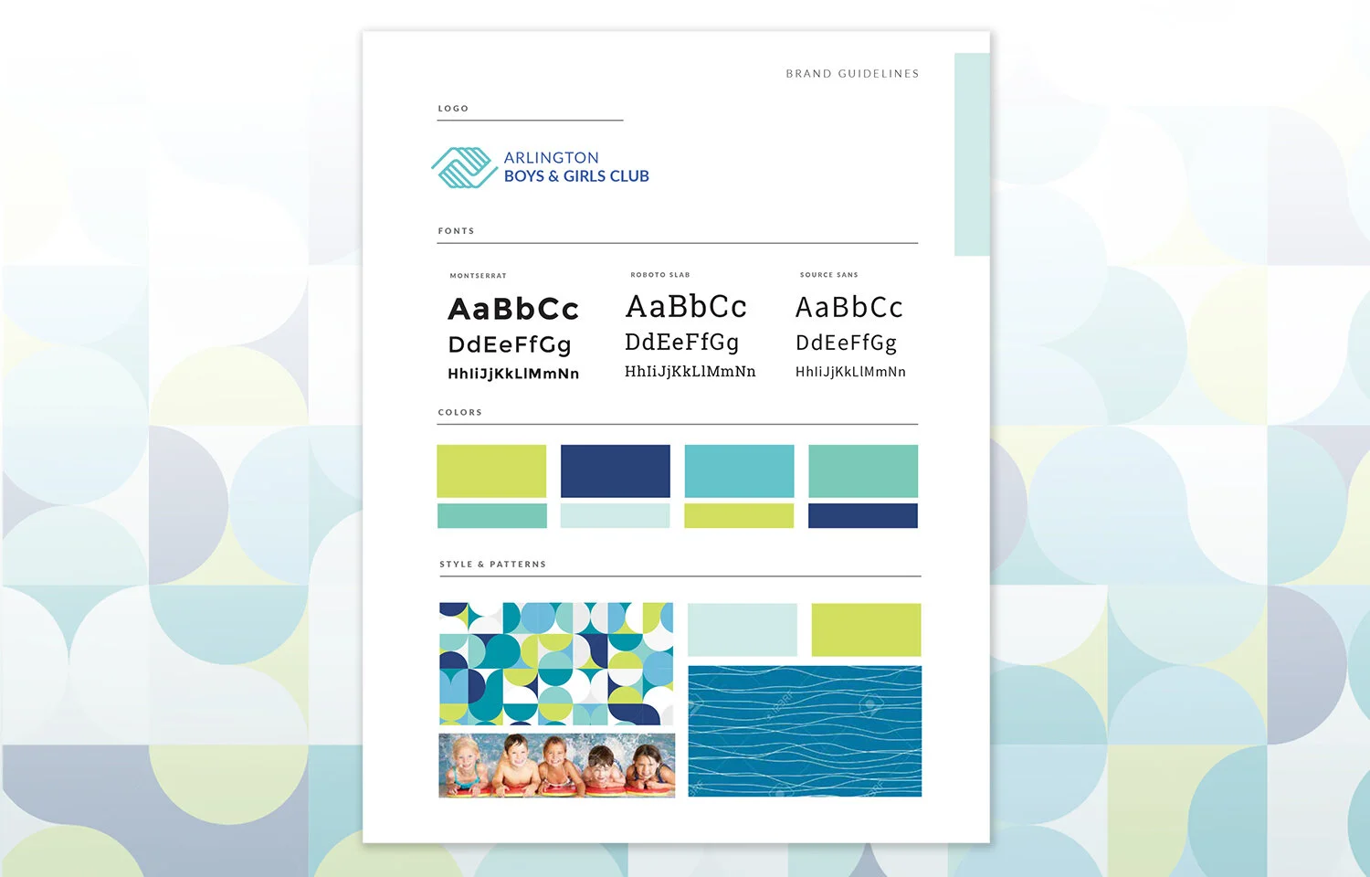
Identity + App Design
ABOUT: ABGC is a community center with programs and activities for ages 6 months to adult, with a focus on programs to enrich youth ages 6-18. Programs emphasize leadership and character development, education, health and life skills and sports, fitness and recreation.
PROBLEM: Users feel that the ABGC website is confusing and hard to navigate. The program registration process is frustrating and stressful due to slow loading-pages, missing information, and unclear steps.
SOLUTIONS:
Better search results through reorganized program categories and providing more choices to refine
Cleaner, more organized layout helps to put focus on content
Streamlined registration process
Mobile option for on-the-go parents and students personalizes and simplifies registration and account management
Deliverables: Identity Development: color palette, brand patterns, photos, style guide. UX Design: user research, user personas, content strategy, wireframes.
Role: UX/UI Designer, Art Direction
Process
Research + Define
Understand users by conducting surveys and interviews.
Evaluate and synthesize a competitive heuristic analysis report
Create empathy maps and personas using the data/findings from the surveys and interviews
Ideate
Create user stories
Information Architecture
UX Content Strategy
User Flows
Card Sorting
Sitemaps
Prototype
Sketching + Wireframing
Prototyping in XD
Evaluate + Refine
Usability testing
Collect input and feedback from users
Research + Define
User research
I created a screener survey in google forms to find participants for my research. After going over the results from that survey, I selected a few to interview in person. From there I was able to put the findings into a User Interviews Summary.
User Interviews Summary
After conducting user interviews with questions about the experience of registering for activities and using the ABGC website, the following key themes and insights emerged: Key Themes The lack of click-through directly from activity information area to registration.
Having to “pre-research” activities in order to be able to use the registration part of the site. There is a disconnect between the activity offerings and descriptions content and the ability to register for the activity. Running into a PDF download is annoying and adds more work/too many steps for the user. PDF of activities is not searchable.
Search feature is not easy to use. It does not show the options and combinations wanted. Some are “hidden” by the lack of a scroll feature or some other indicator to let the user know there is more to the list.
Confusion over whether or not an activity was added to the cart. “Add to cart” button is below the fold and hard to see. Having two steps to add to cart is not intuitive.
The 5 am registration start time is stressful and inconvenient.
Lack of information on how many spots are left in a class or how long the waitlist, is frustrating.
All would welcome an alternative way to register via mobile app vs the website.
Confirmation of registration success is slow, so it adds a level of stress and anxiety.
Insights
All users agreed that the navigation from learning/research to purchasing is not a seamless process coupled with the competitive nature of supply and demand, and the 5am start time, it causes a lot of frustration and stress.
Usability Analysis
Using Nielsen Norman Group’s 10 Usability Heuristics for Interface Design,
I evaluated two similar websites, then synthesized the heuristic findings into actionable items for my own re-design/design project.
Heuristic Analysis Report
This competitive analysis focuses on the task of searching/locating an activity and the user journey through the check-out process. It reviews the client website: Arlington Boys and Girls Club and two competitors: Cambridge School of Culinary Arts and Lexington Christian Academy X.
The competitors were chosen not as direct competitors but as examples of activity registration systems.
The evaluation takes into account all of the ten usability heuristics, but focuses on the Visibility, Consistency, and Minimalism heuristics.
Each competitor offered significant advantages over the client’s website. In particular:
Competitor 01 (CSCA)
Excellent performance in terms of mobile registration ease of use.
Efficient and simple purchasing experience.
Competitor 02 (LCAX)
Strong in giving the user feedback and guidance as to where they are in the process.
Clean and consistent site layout and design.

Empathy Mapping, Personas, & Scenarios
In order to help align strategy and goals to specific user groups, I took the data and findings from the surveys and interviews I conducted to create empathy maps and personas.
By defining a clear picture of who the ABGC users are, I was able to:
Visualize user needs
Use as a starting point for user knowledge
Focus my design ideas beyond my own experiences
Empathy Mapping & User Stories
These methods help to take into consideration how users are thinking and feeling. They help bridge the gap between personas and design concepts.


Ideate
Content Strategy: Card Sorting and Information Architecture
In order to understand how a user sees and organizes the content on the site, I conducted a card sort with multiple users. I then used the findings from that exercise to organize the information into categories that became the site map.
Content Strategy: User Flows
Using the site map and content information, I imagined and charted out the path a specific type of user would take to accomplish a task on the site.
Prototype
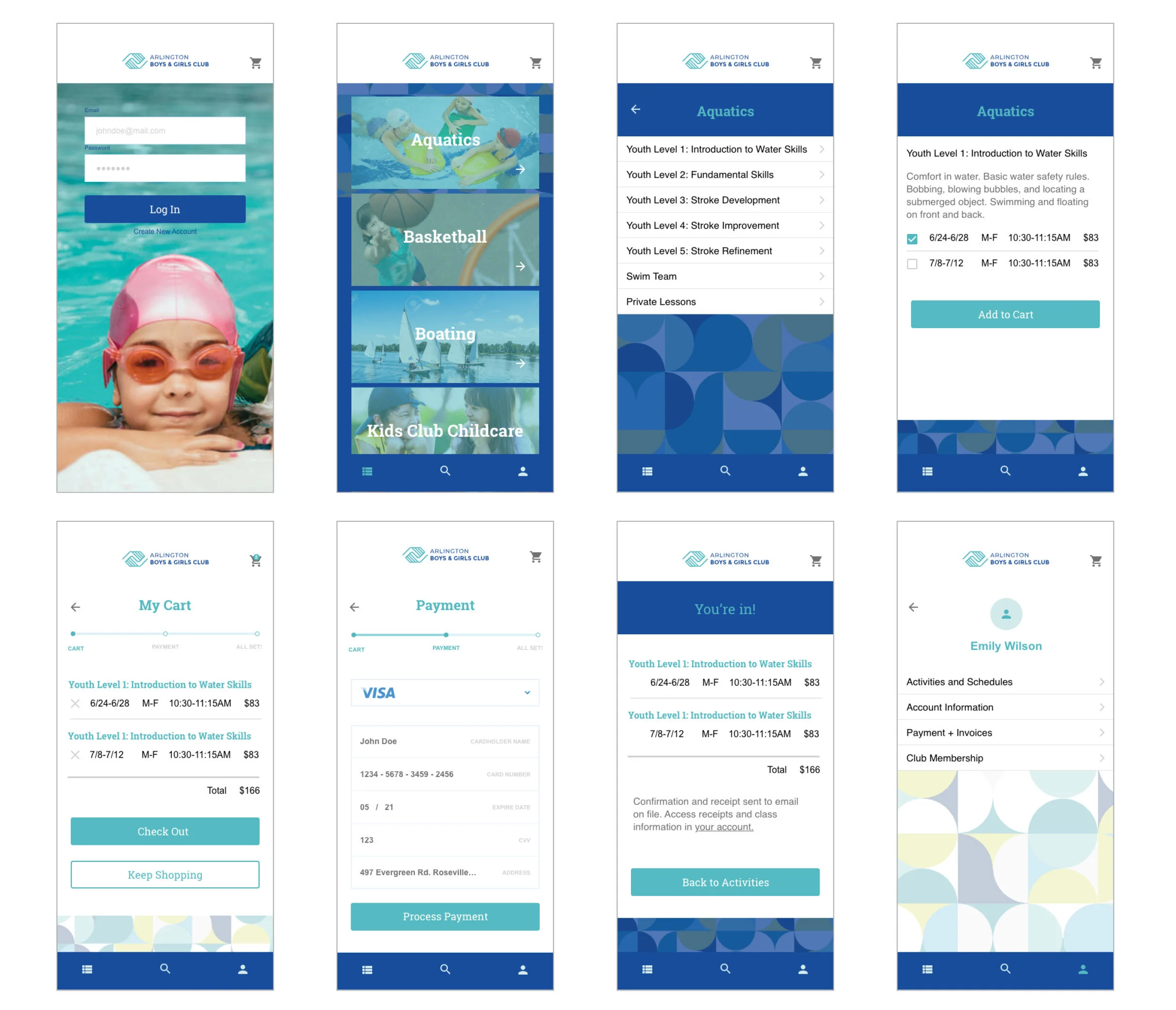
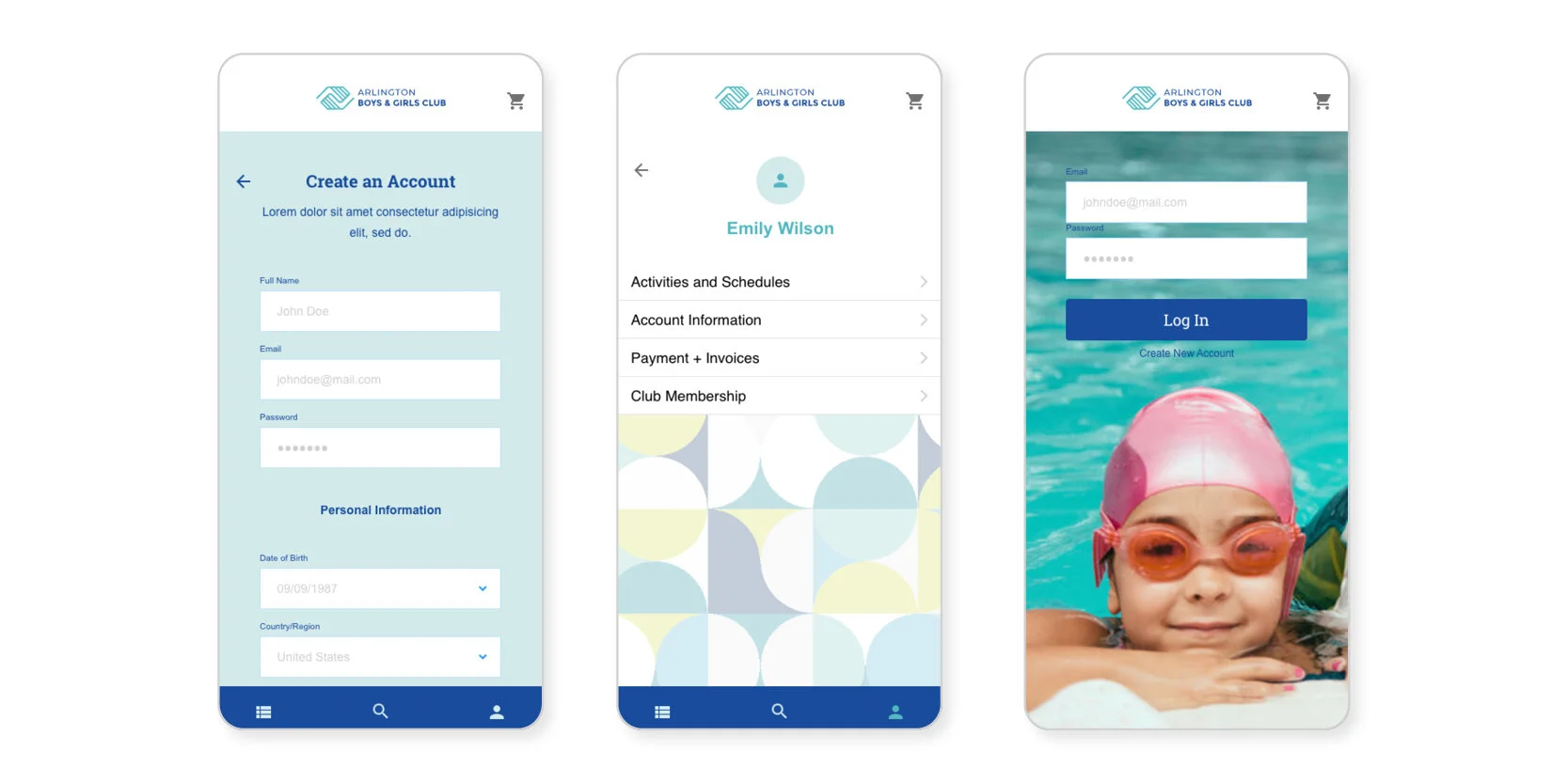
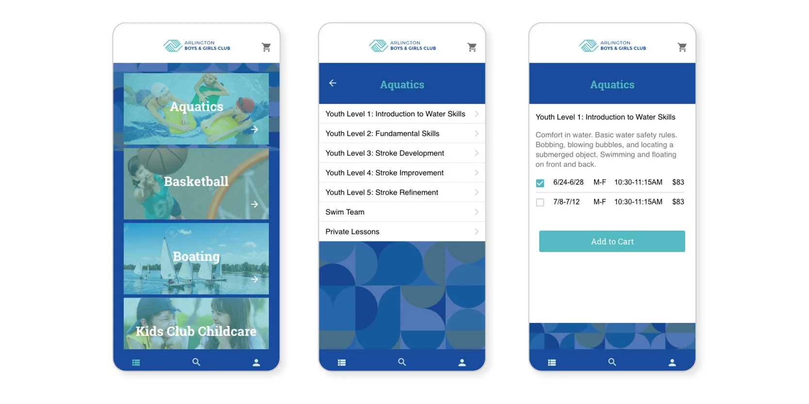
Designing the Prototype
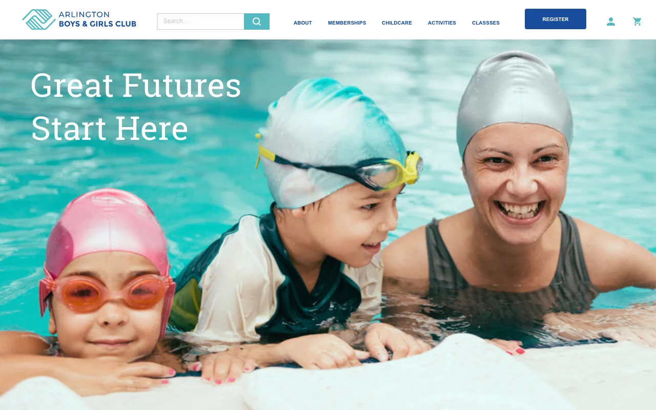
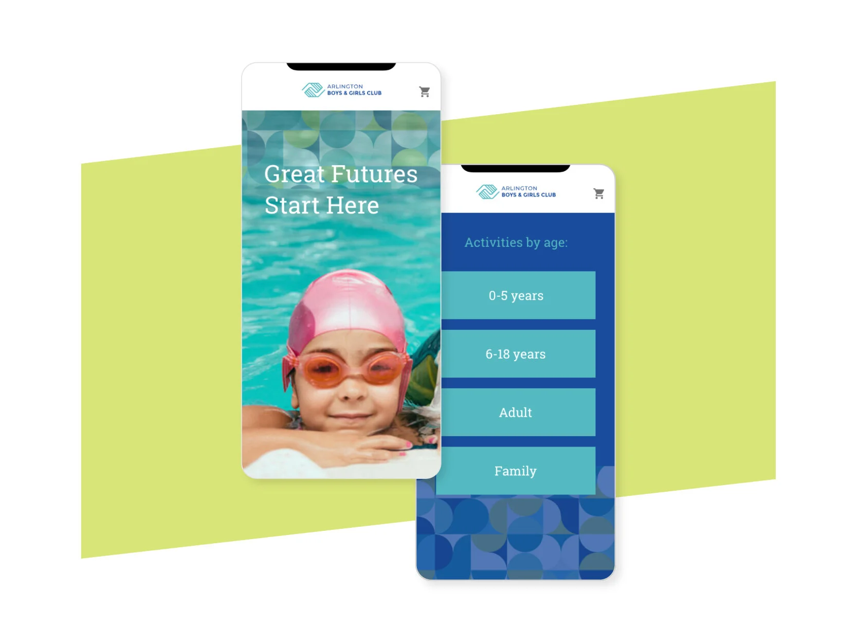
Using the site map and user flows as a guide, I sketched out wireframe pages and screens, then connected those together to create a prototype of the site and the app in Adobe XD.
What I learned most from this phase was to test early and often, quickly getting the ideas down to create the pathways and the functionality, then getting user feedback to steer the next steps.
This was a new experience for me as the design process for marketing and communications is about fully rounding out concepts and then “presenting” that and getting feedback. This is a process that involves a much more collaborative approach throughout. I noticed that I needed to shift my energy to more of the problem solving space and make a conscious effort to not get too deep into the visual design too soon. Similar to designing for communications, I kept coming back to my research and problem objectives to anchor my design decision making.
Evaluate + Refine
Usability testing
After working out the screens and content organization in the wireframe phase, I moved on to building out the app version into a hi-fidelity prototype. At this point I applied a new visual identity system to create a cohesive and consistent look throughout. Using that mock-up in XD, I was able to test the interactions and tasks with users. Their feedback helped me to further refine some of the menu items and categories.